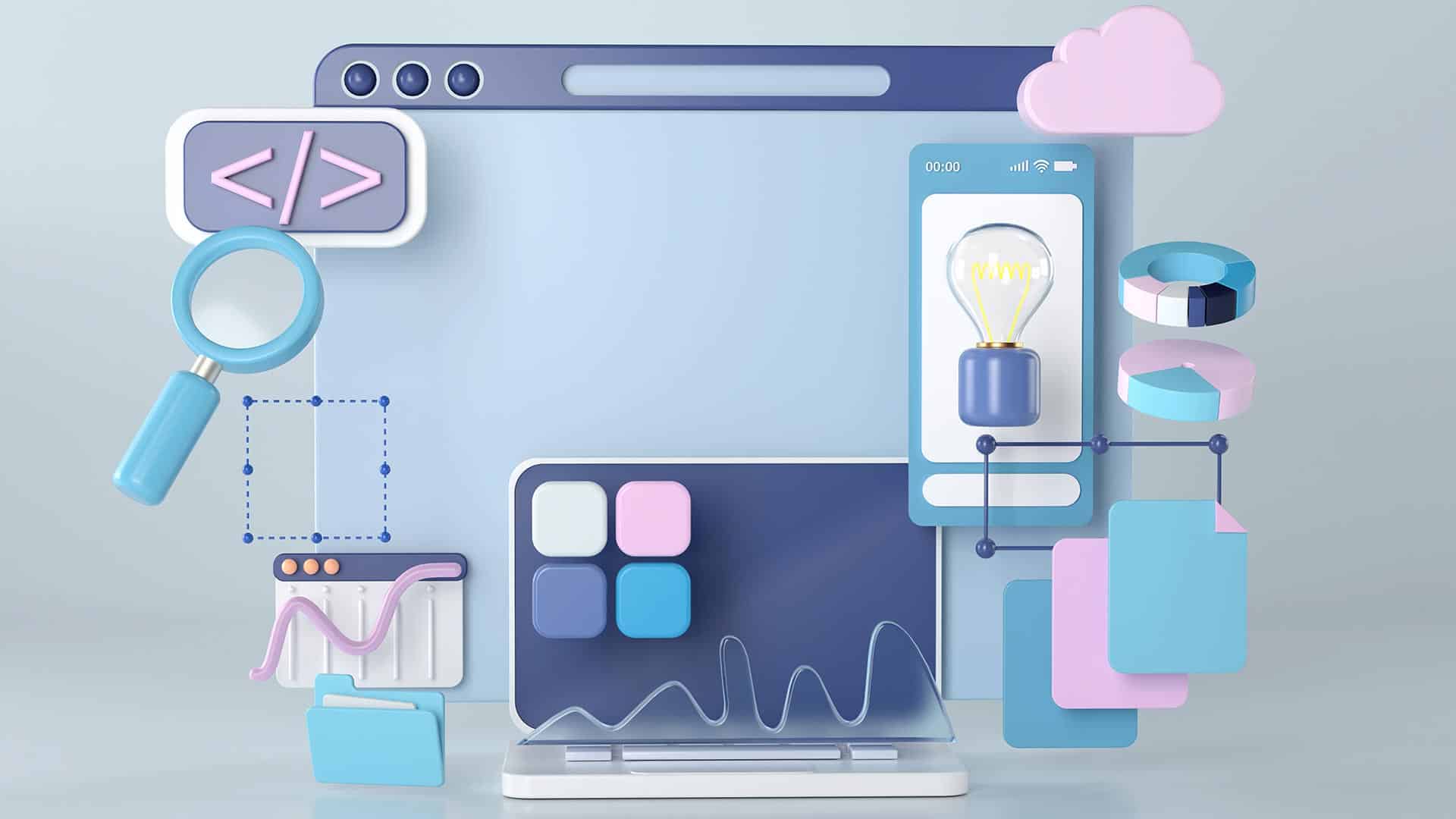
UI animations have come a long way over the last decade. Animations don’t just look awesome, but they have evolved into a universal digital language that end users recognise and understand.
These micro-interactions allow designers to communicate with users through movements and animation to provide the user with guidance, context, and an immersive user experience.
In this article we will explore UI animations – the types, principles and some everyday examples to improve user interaction for your digital product.
What Is UI Animation?
UI animation, or user interface animation, adds visual effects to UI elements and components to make them interactive. This interactivity helps guide users through a website or digital product while creating an immersive and enjoyable experience.
UI Animations & Micro-interactions
Micro-interactions occur in four stages:
- Trigger: user action or system state change
- Conditions: system rules that define what micro-interaction is triggered
- Feedback: visual, audio, haptic changes to the user interface
- Mode: what happens once the micro-interaction is complete – state or UI changes
UI animations occur during the feedback and mode stages when a user interface changes in relation to the trigger and conditions.
Why Is UI Animation Important?
The primary function of UI animations is to draw the user’s attention to an important Call To Action or show them what to do next. UI animations allows a designer to communicate with a user without text.
For example; a progress bar will animate to draw the user’s attention so they can see how much of a signup process they must still complete. The alternative to this would be to add text somewhere on the user interface, stating something to the likes of, “you have completed 20% of the signup process.” As you can imagine, a user interface would get very cluttered, messy and confusing if text were to replace these UI animations.
UI animations also allows designers to communicate with users across cultures and languages. Animating a button to show a user where to click (or tap) will attract their attention, no matter the language they speak.
Lastly, UI animation plays a crucial role in design psychology and reducing cognitive load. Designers minimise the mental effort required to use a digital product by providing context, familiarity, and consistency through animations.
Types of UI Animations
There are five primary types of UI animations:
- Loading and progress
- State changes
- Navigation
- Micro-interactions
- Branding
UI Animations | Loading And Progress
Loading and progress allow users to visualise where they are or what is happening.
- Loading: an animation showing the user that the system is working. For example; a loading animation (throbber) or percentage indicator showing a user that a product is busy loading a page or processing information. These loading UI animations are critical, without them users might think that the product or website has stopped working – which could result in the user abandoning the website or product before it has had a chance to load.
- Progress: animations that show users where they are in a flow and how much they still have to complete. For example, a progress bar at the top an eCommerce checkout flow animates each time the user moves closer to completion.
UI Animations | State Changes
Designers often make use of animations to communicate a digital product’s (or element) state.
For example; a button might remain in a dark and unclickable state until a user performs a required task such as completing required form fields. Once the form is complete, the button’s state changes to active (or clickable), letting the user know they can now click on the button to proceed.
Structure & Navigation
Navigational UI animations help users to navigate user interfaces and find what they want. Designers will use animation to show users which page or tab they’re viewing or create page transitions that indicate which direction they’re moving.
UI animation is also helpful to communicate navigational hierarchy so users can understand the product or website’s structure – resulting in a more enjoyable user experience.
Micro-interactions
Micro-interactions convey feedback and information based on user interaction or system changes. This feedback and information almost always include some type of UI animation.
A micro-interaction we see every day is a mobile text or message notification. When you receive a text, a popup appears on your phone to alert you. In some instances, the alert will show you the whole text message before minimising it to show the sender’s name. This entire notification sequence is a UI animation triggered by the system.
Another common micro-interaction is how a digital product responds to scrolling or swiping. As you perform these actions, multiple UI animations may take place, like a page transition, content loading, navigational changes, and more.
Branding
Animations are a fantastic way to promote brand awareness and interaction with users. Designers will often use fun logo animations to give the brand a lighthearted, welcoming appeal.
UI Animation Examples
Here are some creative UI animation examples designers have used to improve a product’s user experience.
1. An eCommerce UI Animation That Gives Users Control
Dribble freelance UI designer Dannniel uses UI animations to give users a sense of control while shopping online. In an animation UI design concept for a shoe-seller, Dannniel created and interface where users can learn basic information about a shoe (such as price and reviews).
Dragging to the left will open a screen overlay (simultaneously activating several UI animations) were customers can choose their size and colour preference.
Why does this UI animation matter?
Even the most successful eCommerce stores struggle to make shopping engaging and fun. These sites often have cluttered page layouts that aren’t always obvious for users and involve lots of clicking or tapping to access drop-down menus. These cluttered user interfaces don’t create a sense of control or fulfillment.
With Dannniel’s UI animations, shoppers can access and select product variants using one hand – perfect for users on a mobile device. As you scroll through the sizes, the product changes too. These small details create an immersive, more enjoyable shopping experience.
2. A Budget App Built on Colourful Intuition
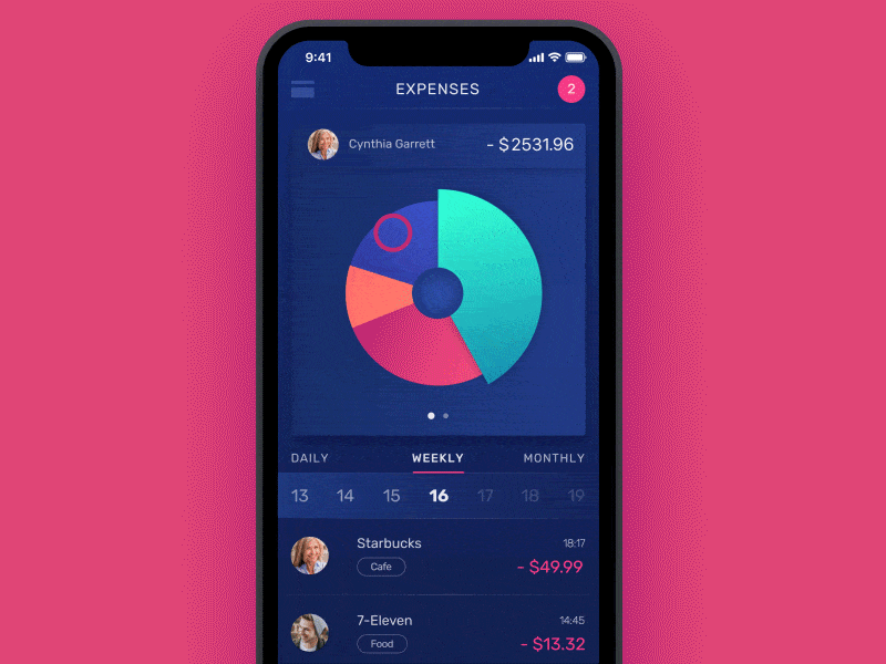
Design agency Tubik has made hundreds of animated user interfaces for its clients. This budgeting app stands out for its brilliant use of motion and colour to help users with their financial goals.
When a user opens the app, they are able to see their daily, weekly and monthly expenses that are expressed in a segmented circle graph. Each segment of the graph represents a different expense category with its own colour, so the user can easily differentiate between each one. When the user taps on a segment within the graph, and exciting UI animation creates a horizontal bar chart to display the expenses differently.
Why does this UI animation matter?
Most people dislike budgeting and personal finance. It feels uncomfortable to confront financial decisions, especially when you might need to cut spending to focus on saving money or repaying debts. Below are two ways Tubik’s mobile app design and UI animations make budgeting easier for users:
- The UI animations gamify budgeting, making the experience of using the app and confronting your personal finance more fun. The colours and motion help ease the user’s anxiety by connecting an undesired activity (budgeting) with something more enjoyable and fun (video games). Users tend to be more likely to use a personal finance app that gamifies the experience and rewards them with colour and animations.
- The app allows users to visualise their personal finance in colours and charts rather than in numbers on a page. These charts enables the user to absorb the information much easier, which could help them in turn to manage their finance better – at the very least, make them more aware of their income and their expenses.
3. UI Animations Makes Failures Less Frustrating
Animated components can minimise the frustration of errors, for example, if you make a typo in Grammarly, the app highlights the word in red. When you click on the highlighted word, Grammarly displays the correct word or suggestions for you to choose.
When you click on the correct word, Grammarly automatically changes the word for you – no need to retype the word to correct the error that was made.
Why does this UI animation matter?
No one likes coming across errors, mistakes or failures, UX designers can create UI animations that make errors less frustrating and provide users with solutions to fix the problem.
4. UI Animations to Create a Mood
Breathe app for iOS Concept – InVision Studio | Daniel Korpai for InVision
Designers can make use of UI animations to create a mood or energy throughout the digital product, for example, in popular meditation apps, when the user starts a meditation session, a large circle pulses in and out. This very simple UI animation compliments the physical action of someone breathing, thus creating an immersive user experience.
Why does this UI animation matter?
Designers use appropriate UI animations that matches the specific digital product. Slow and smooth animations make sense for a breathing and meditation application because you want the user to be calm and peaceful while they are using the app.
Summary
UI animations can play an essential role in guiding users through the product experience. Good product design makes use of UI animations to communicate with the end user to make the digital product more straightforward and more enjoyable to use.