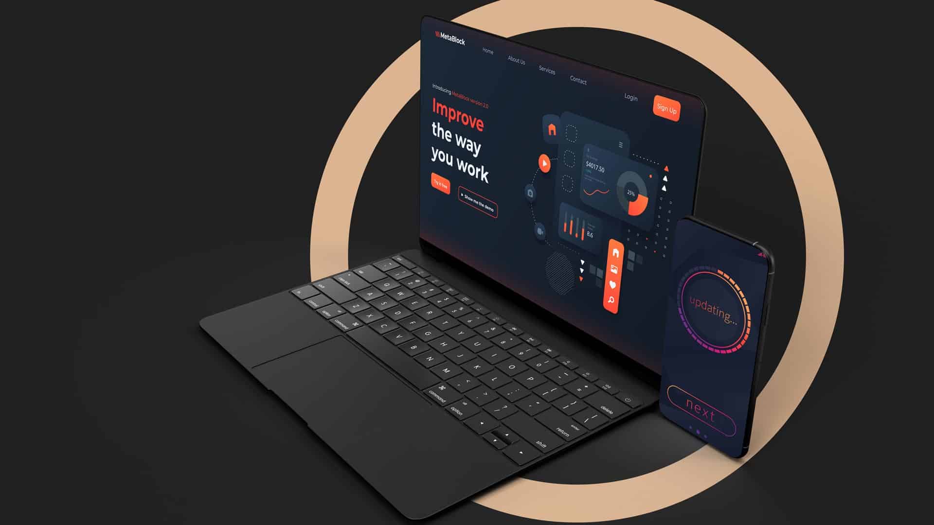
Dark UI Design: to Do, or to Don’t?
Implementing dark backgrounds and patterns in web-, mobile-, and software applications continues to gain traction. So, when asked whether a light-based user interface, or a darker one is better, there simply is no straightforward answer. There are however several considerations that can help you make the right choice between a dark UI and a light UI.
Theme switcher animation by Jakub Antalik
What is UI Design?
Before we dive into the pros and cons of a dark website design and light website design, let’s first have a look at the definition of a user interface (UI) and user interface design.
So what is UI? User interfaces are the access points where users interact with designs. Depending on the software application, a user interface can be either graphical, voice-controlled, or gesture-based. A computer is considered to be a graphical user interface (GUI) whereas smart assistants like Alexa or Siri are considered voice-controlled interfaces (VUIs). When a user engages with 3D designs through bodily motions, we talk about gesture-based interfaces (GBIs). Virtual reality games for example are referred to GBIs.
What is UI Design? The user interface design of a software application is what the user sees and interacts with on the screen. The UI design shapes not only what the user will see, but equally important, how the user will interact with the design of a product as part of the overall design experience.
That being said, the user interface (UI) should not be confused with user experience (UX) which covers all aspects of the end-user’s interaction with a company, its web presence, mobile applications, or software systems.
How to Choose Between Light UI and Dark UI?
Making the decision between using a dark vs a light colour for your user interface should be more than just a personal preference.
Users
Knowing your potential target audience and understanding their needs and preferences should always be a first step in designing UI for your website, app, or software products. Will they use their UI mostly during daytime or during the evening hours? Does your product contain a lot of text, or will the interface be minimalistic?
Branding
A brand’s style is the look and feel behind the brand’s aesthetic. If a brand is known for its use of bright colours to engage with their audience, shifting to a dark user interface could be confusing to the end user. Your brand has to be instantly recognisable, and since colours are linked to memory and emotion, having a signature colour palette will help you to create a consistent identity.
Purpose
The purpose of your website, app, or software product plays an integral role when it comes to the design of your user interface. Who do you expect to interact with your user interface (audience)? What would you like your audience to be able to do?
Understanding colour psychology, the effect colours have on your audience, and selecting one that is in line with the purpose of your product or service is an absolute necessity.
When opting for a light themed website, you need dark, saturated fonts, colours and style elements. In contrast, when you opt for the use of a dark themed website, you will need to implement light, unsaturated fonts, colours, and style elements. This is a general rule that applies to not only websites, but mobile applications and software products as well.
Best Practices for Dark UI Design
A strong contrast between light and dark helps users to guide through an interface and will assist those with vision impairments. Let’s dive in and take a look at some of the best practices of how to implement a Dark UI on websites, mobile applications or software products.
It is important to note that a dark theme is not a black theme. It would best be thought of as a “low-light” theme. One of the main concerns with a dark UI is achieving enough contrast so visual elements have separation.
Most designers would think using black would be the optimal choice to achieve strong contrasts. However, it is in their best interest to not use true black (#000000) for backgrounds or surface colours. Black is best reserved for other UI elements and used sparingly. For example, true black could rather be utilised on small UI elements or a surrounding bezel.
Google’s Material Design Dark Theme recommends using a dark grey (#121212) as a dark theme surface colour “to express elevation and space in an environment with a wider range of depth.” In addition hereto, many designers also recommend adding a subtle dark blue tint to dark greys when defining the colour scheme. The darker blue tint tends to create a better dark tone for digital screens and a more pleasing UI colour palette.
One advantage of using a range of greys in your user interface design is that it gives designers latitude, as it broadens the range of colours that can be expressed. A grey palette also helps to create depth because drop shadows can be seen easier against a grey background versus black.
It is also a good idea to test on various displays and devices for proper contrast between other UI elements, such as cards, buttons, fields, and icons. If there is an imperceptible separation between UI elements, the design blends too much and risks becoming dull.
5 Reasons to Take The Leap and Move To The Dark Side
There are situations in which a dark user interface is recommended, like some of the reasons listed below:
- If your brand’s colour scheme is dark, your user interface should match your brand style and therefore, should adapt to a dark user interface. Your digital presence should always match your brand’s look and feel.
- If your brand has a clean and minimalist look, or you only want core elements to stand out, or if you wish to create a dramatic look or a sense of luxury.
- When you want to reduce eye strain, offering a dark user interface, or a dark mode, will make your end users more comfortable.
- If your platform consists of very little text or a few elements in the design, and you wish to have focus on images or videos instead, then the use of a dark user interface is recommended.
- When consumers will use your platform mostly during the evening hours, having a dark user interface makes more sense. Late at night, a bright interface could be hard on the eyes.
5 Reasons to Stay on the Light Side
- If your brand’s colour scheme is light, your user interface should be too. Always remember your digital presence should resemble your brand at all times.
- When your brand makes use of bright colours, it is recommended to rather use a light user interface.
- When your website uses forms to request user information, or has other interactive components, a bright user interface is recommended because dark user interfaces make it difficult to read forms.
- If there is a lot of text or mixed-media and the purpose of your platform is mainly used for users to read your content it is best to use a light user interface.
- When consumers will use your platform mainly during the daytime, having a light UI design logically makes more sense.
Final Take Away
Designing user interfaces is a creative outlet, let us not bind by its rules unconditionally. An awesome design should help boost user experience and realise business objectives. It should help your users achieve their goal comfortably and effortlessly. So think about these considerations and find answers to the questions before making your choice between a dark and a light user interface.
A light user interface may always look like a safe bet but, in some cases, rather using a dark user interface could be a hands-down winner – so choose wisely.
Whether you choose the Dark Side or not, may the force be with you. A professional agency like M2-D2 can guide you in the right direction and help you with the UI design process, every step of the way. Go ahead and drop us a line or give us a shout to get your digital platform journey the kick start it needs!
") English (UK)
English (UK)  Nederlands